The painter never draws the letters.
Titles are composited afterwards as vector outlines. That is why the spelling is right, the type is identical across all forty, and it stays sharp at any print size.
The park service commissioned these for Yosemite and Zion. Name any place and we will paint yours.
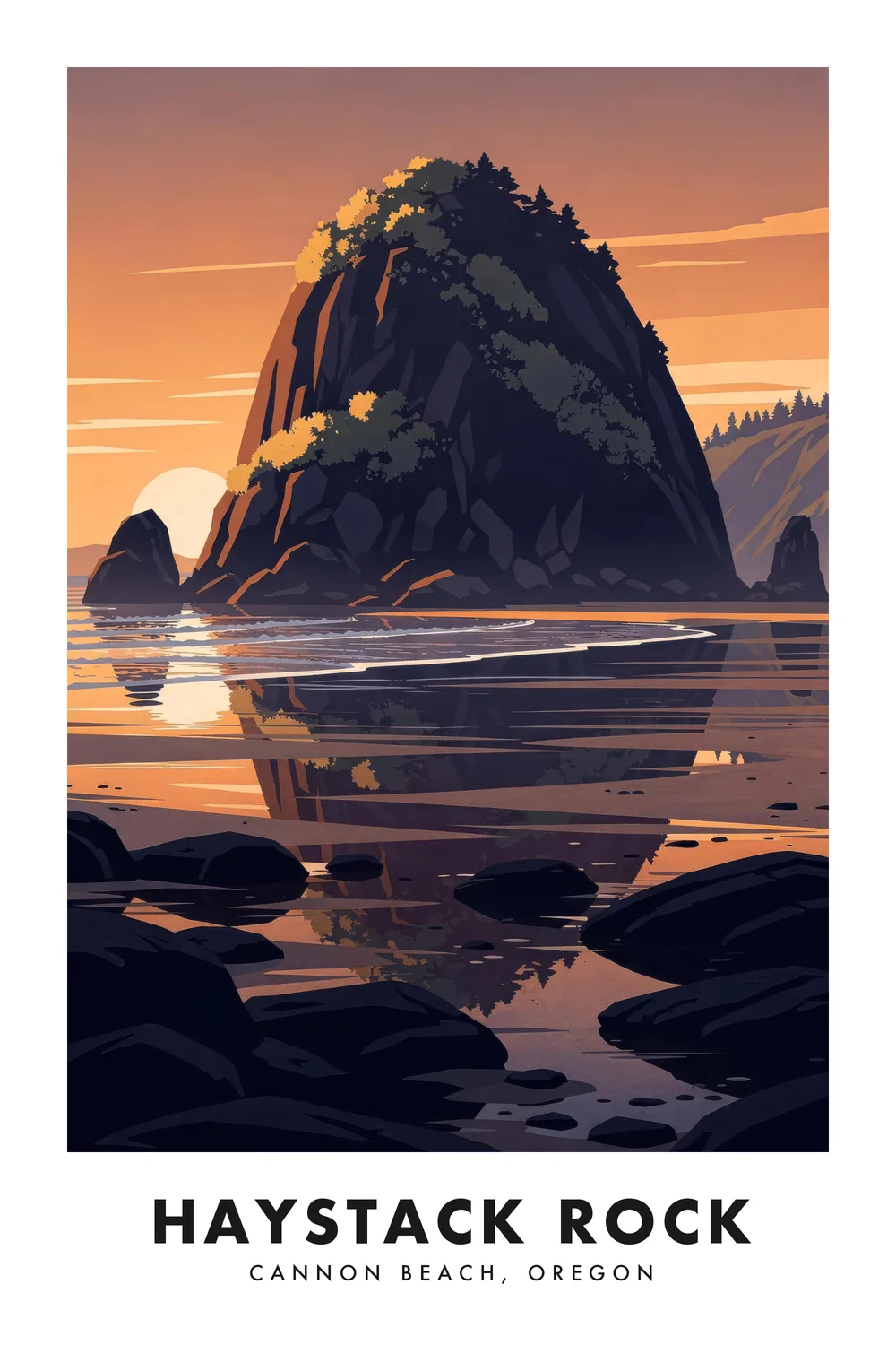
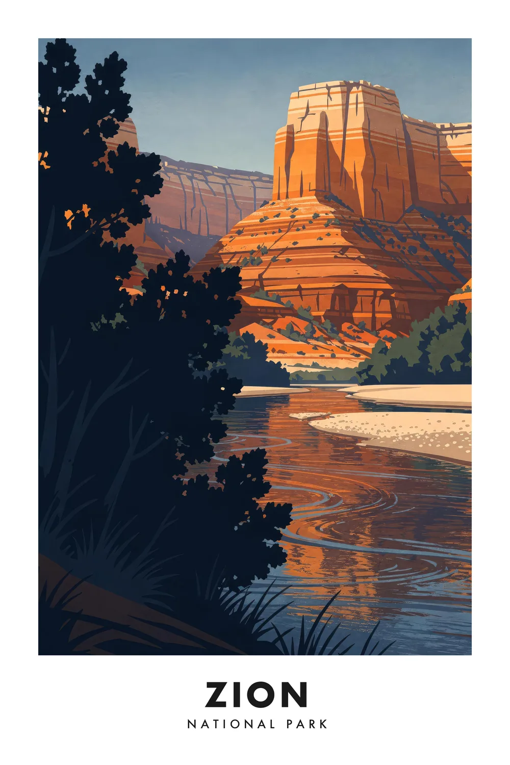
National parks first, then the ballparks, dive bars and named streets nobody thought to draw.
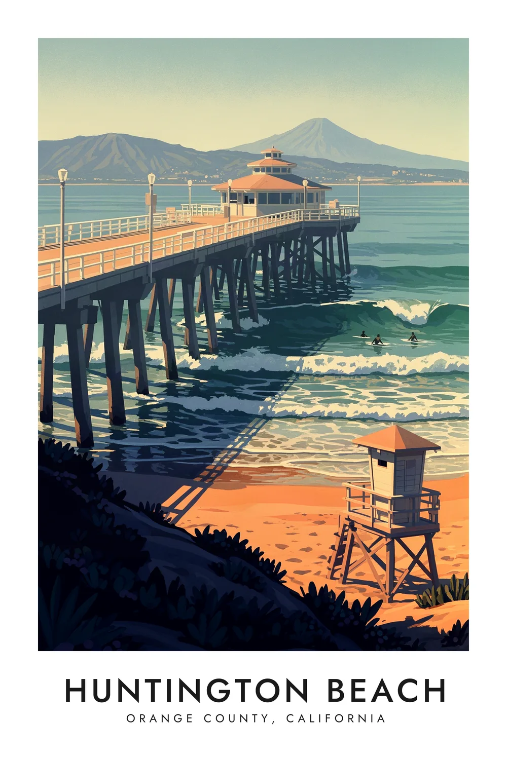
Huntington Beach
California
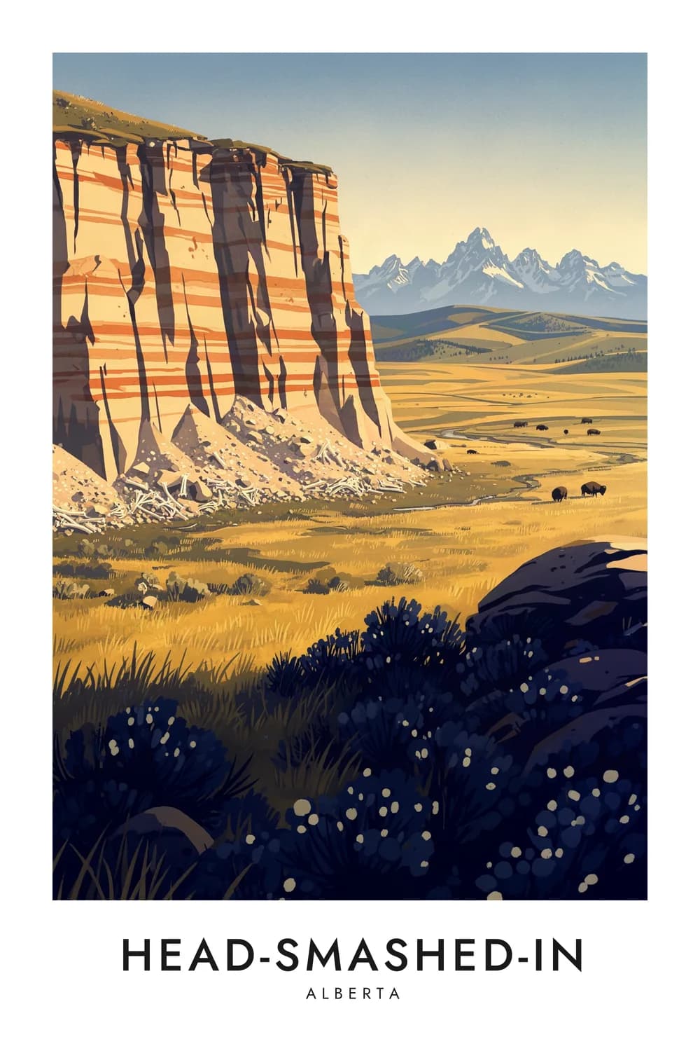
Head-Smashed-In
Alberta, Canada
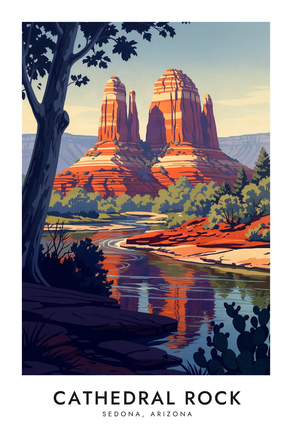
Cathedral Rock
Arizona
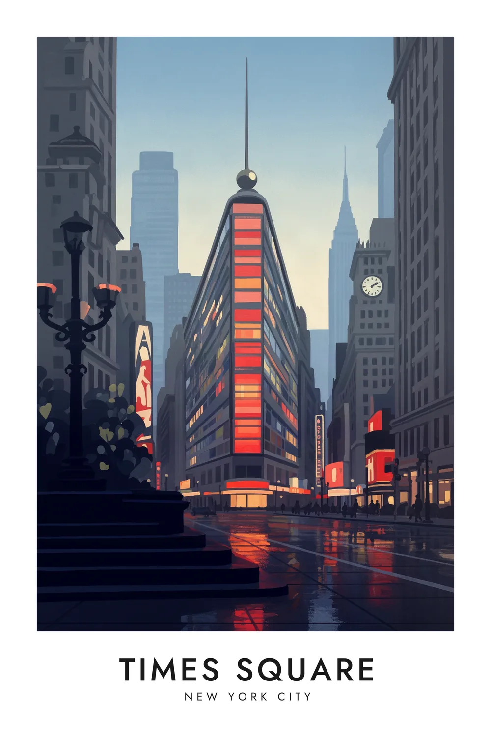
Times Square
New York
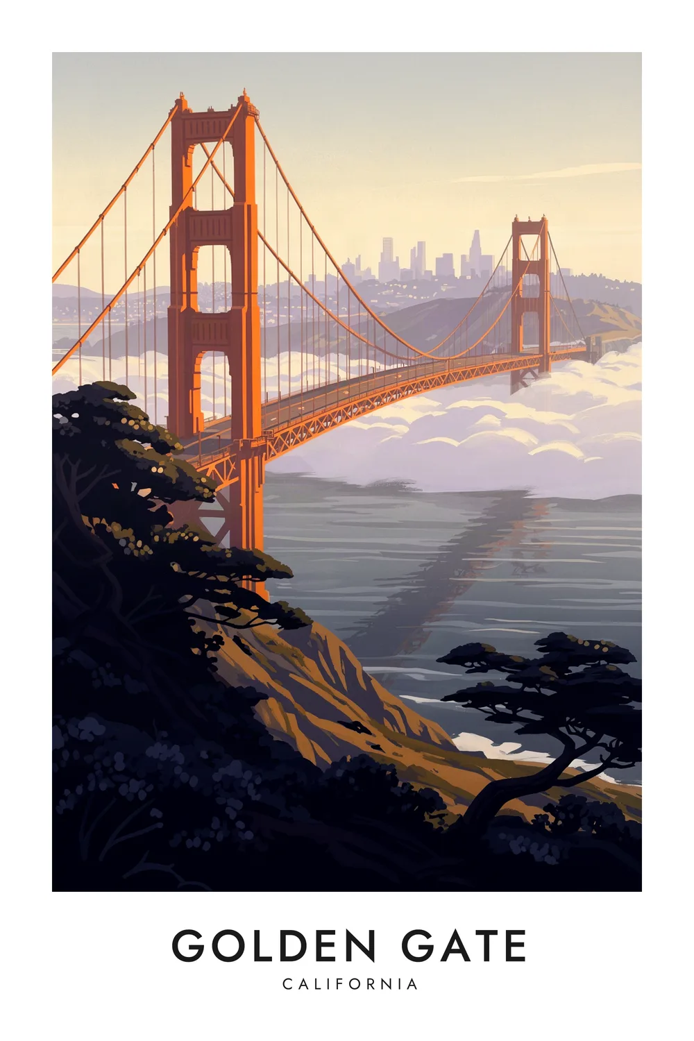
Golden Gate
California
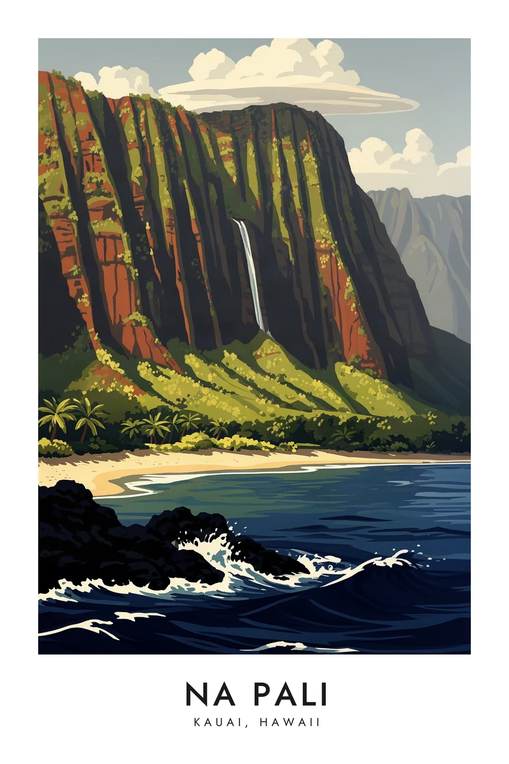
Na Pali
Kauai, Hawaii
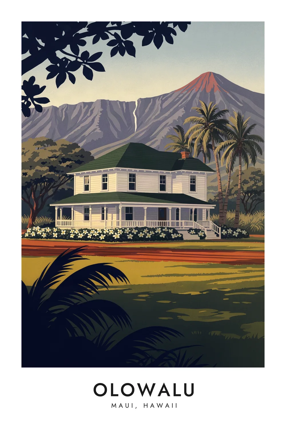
Olowalu
Maui, Hawaii
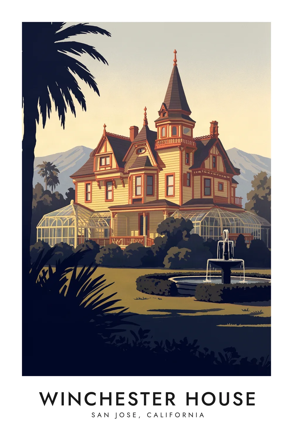
Winchester House
California
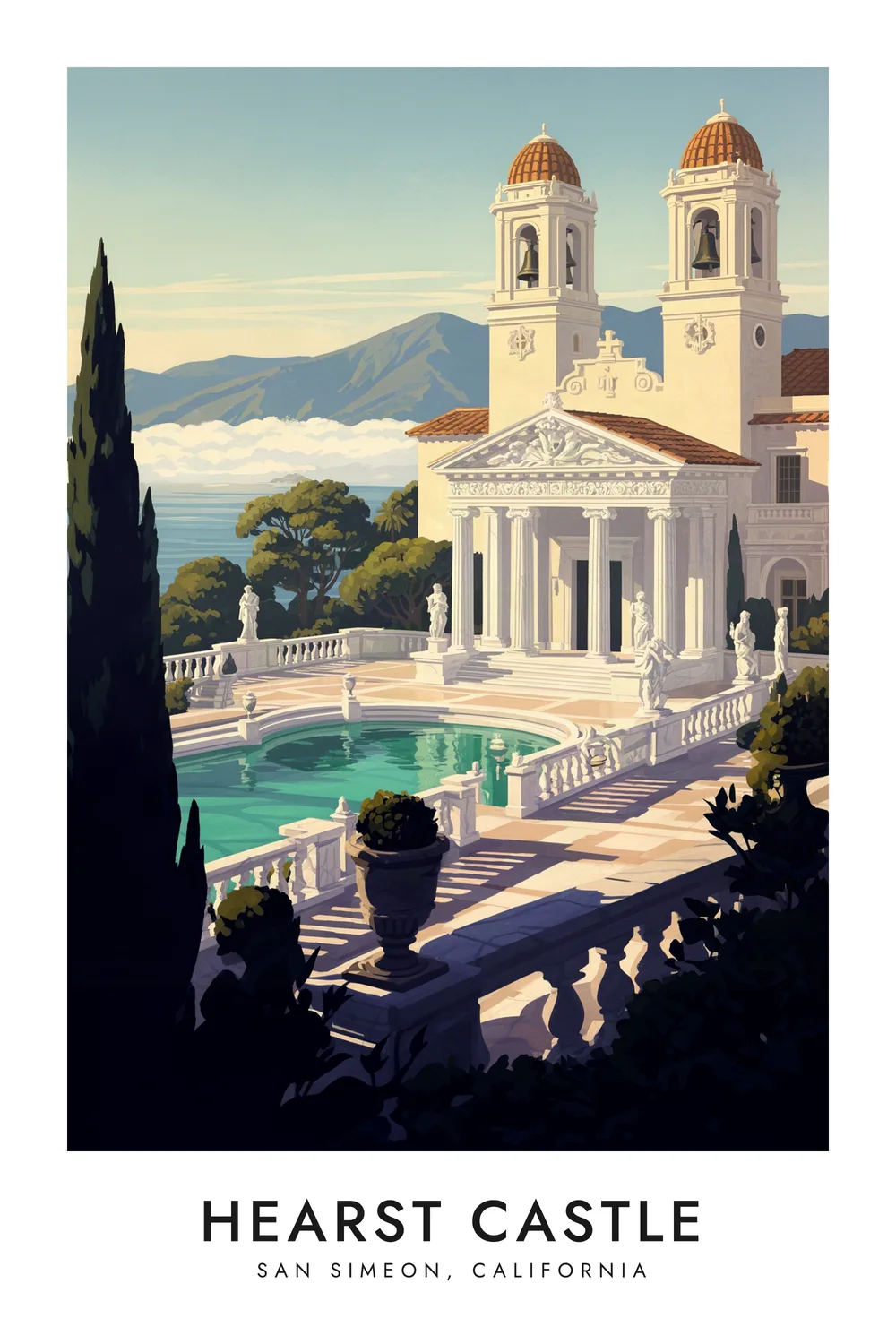
Hearst Castle
California
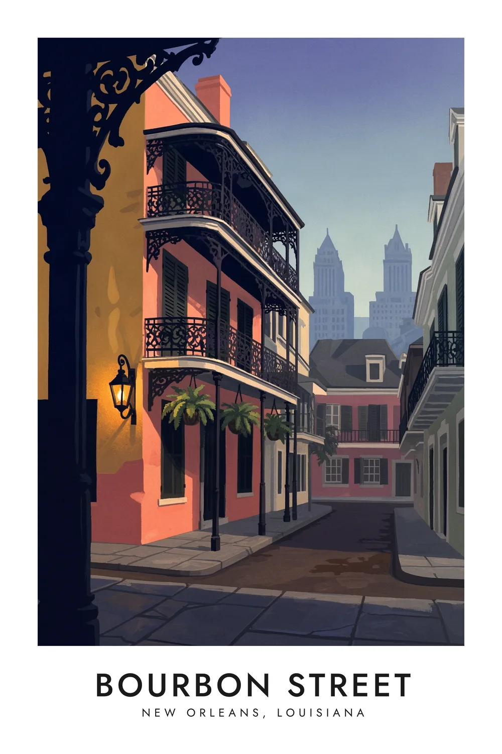
Bourbon Street
Louisiana
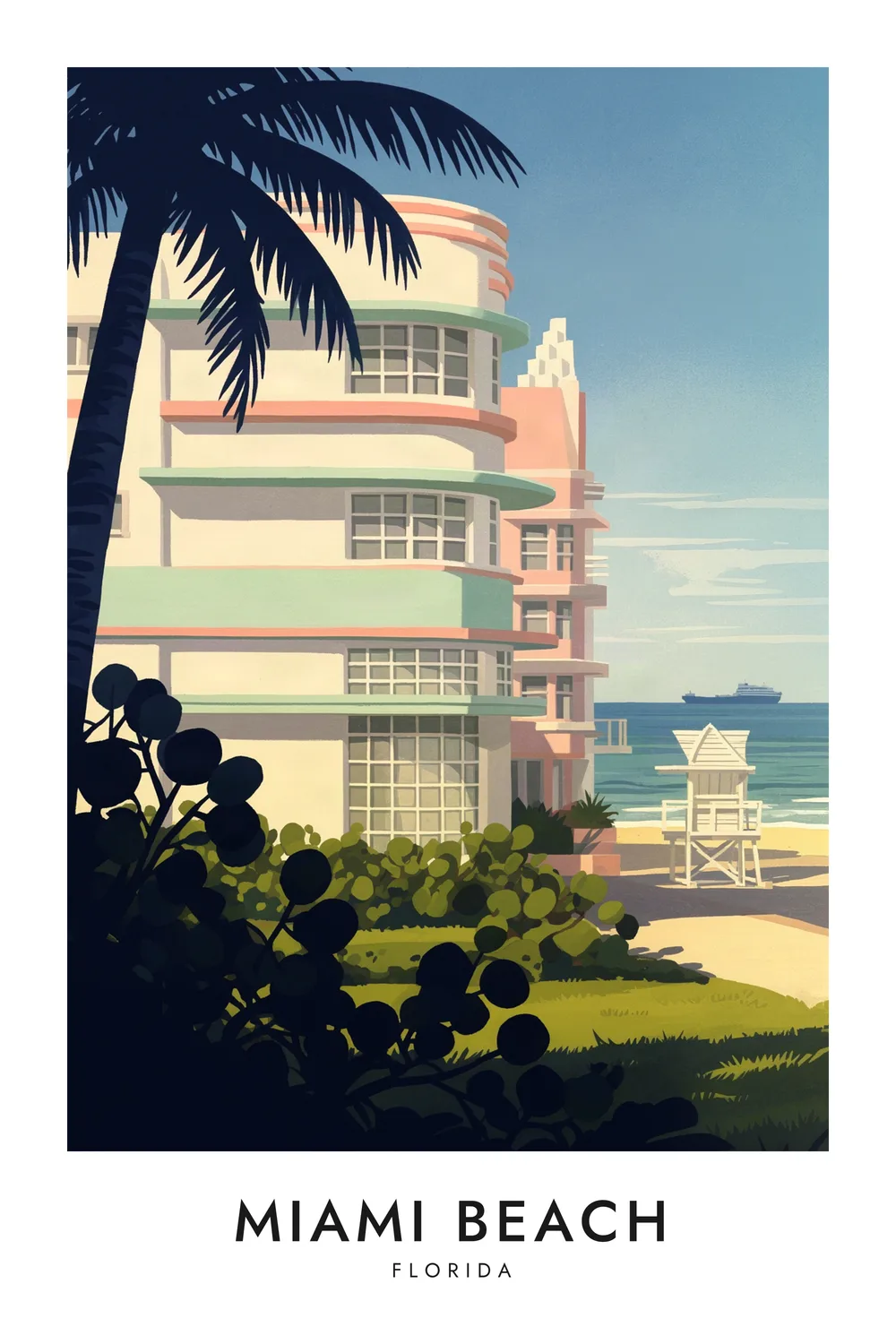
Miami Beach
Florida
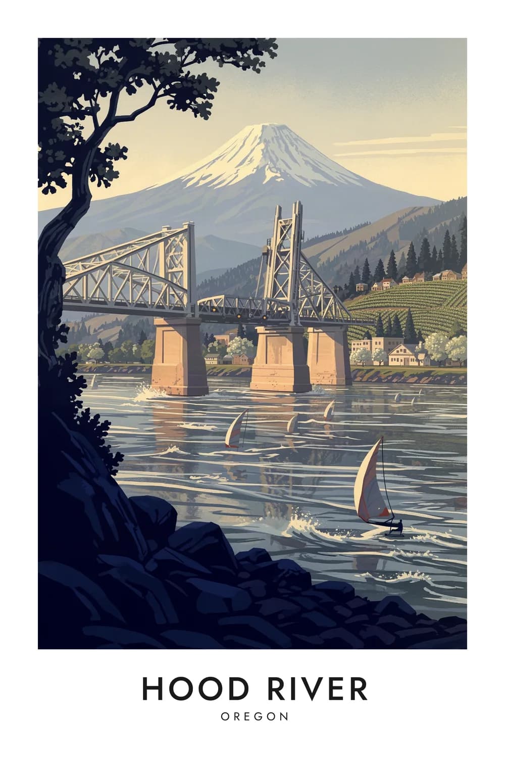
Hood River
Oregon
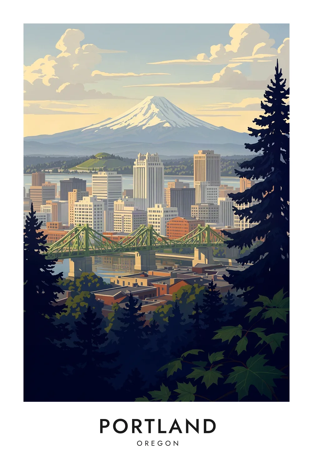
Portland
Oregon
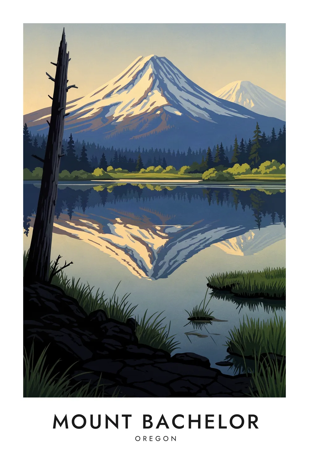
Mount Bachelor
Oregon
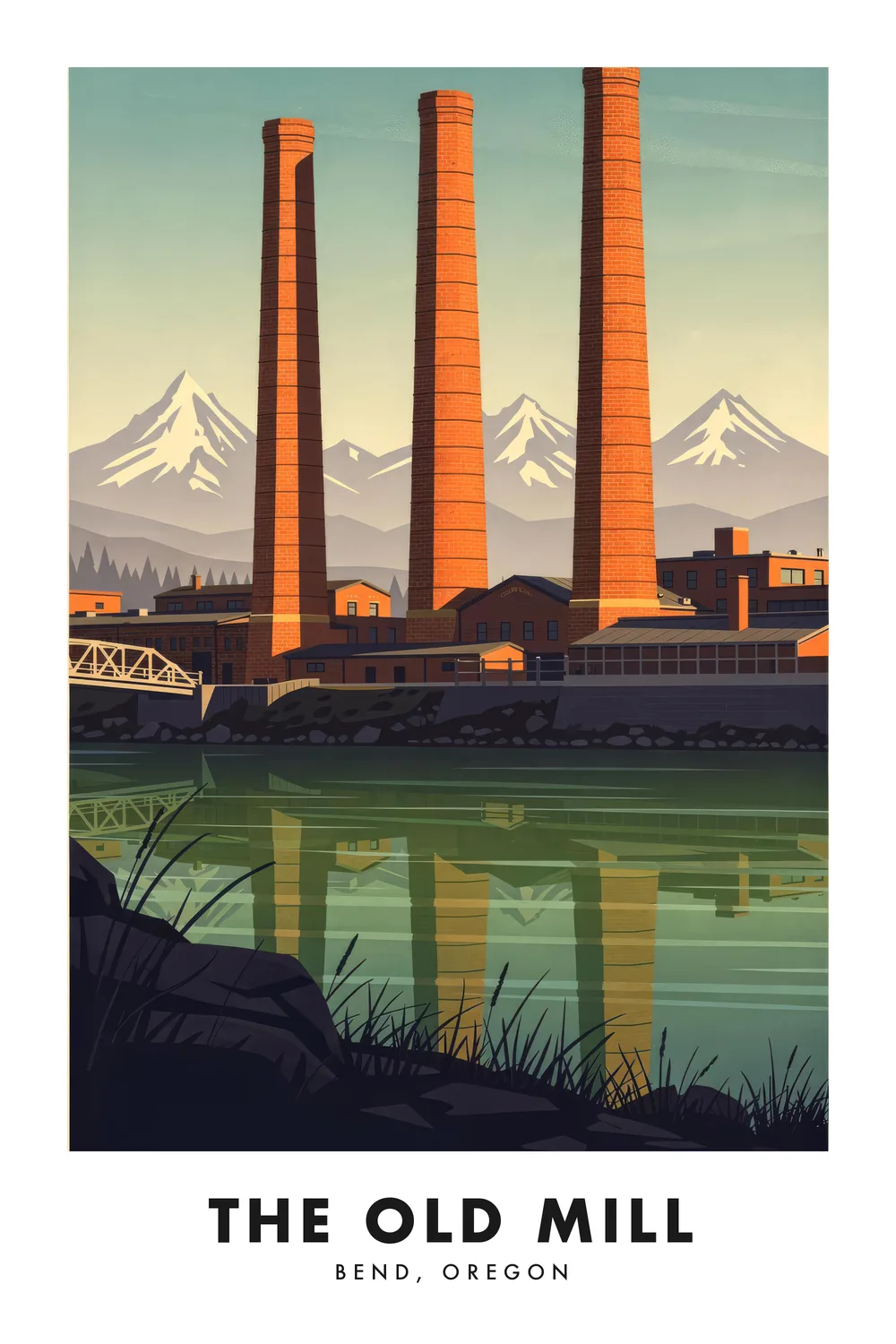
The Old Mill District
Oregon
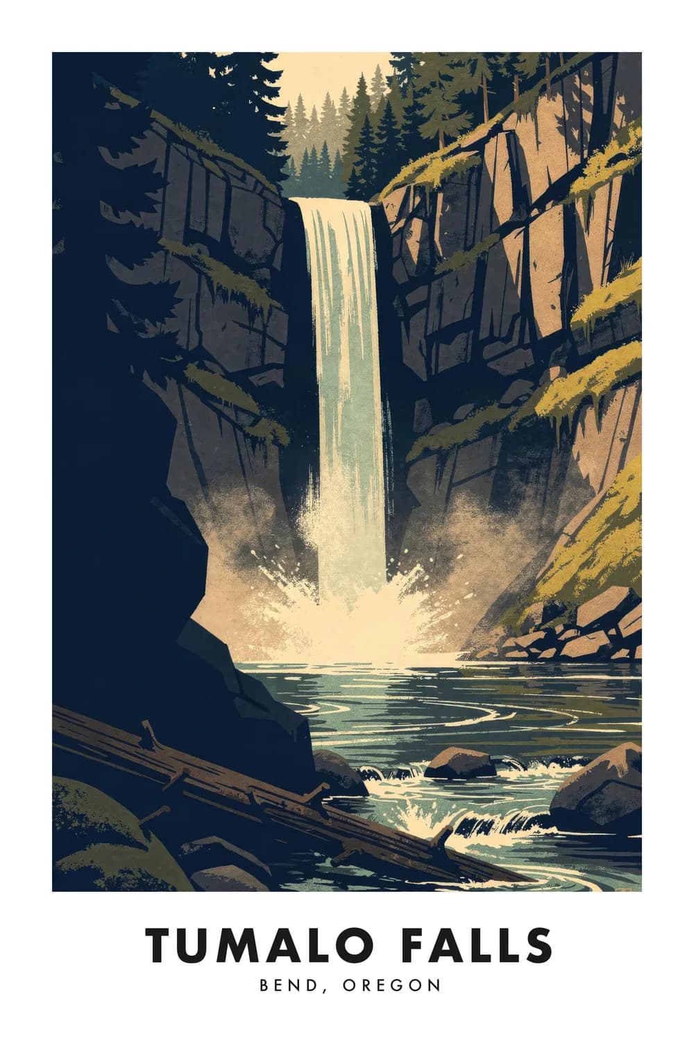
Tumalo Falls
Oregon
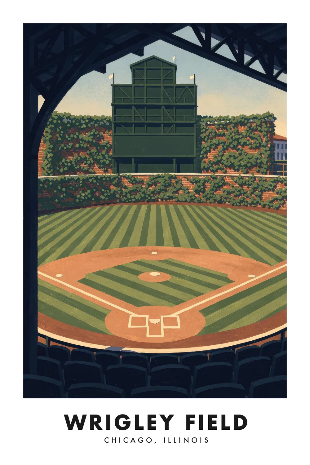
Wrigley Field
Illinois
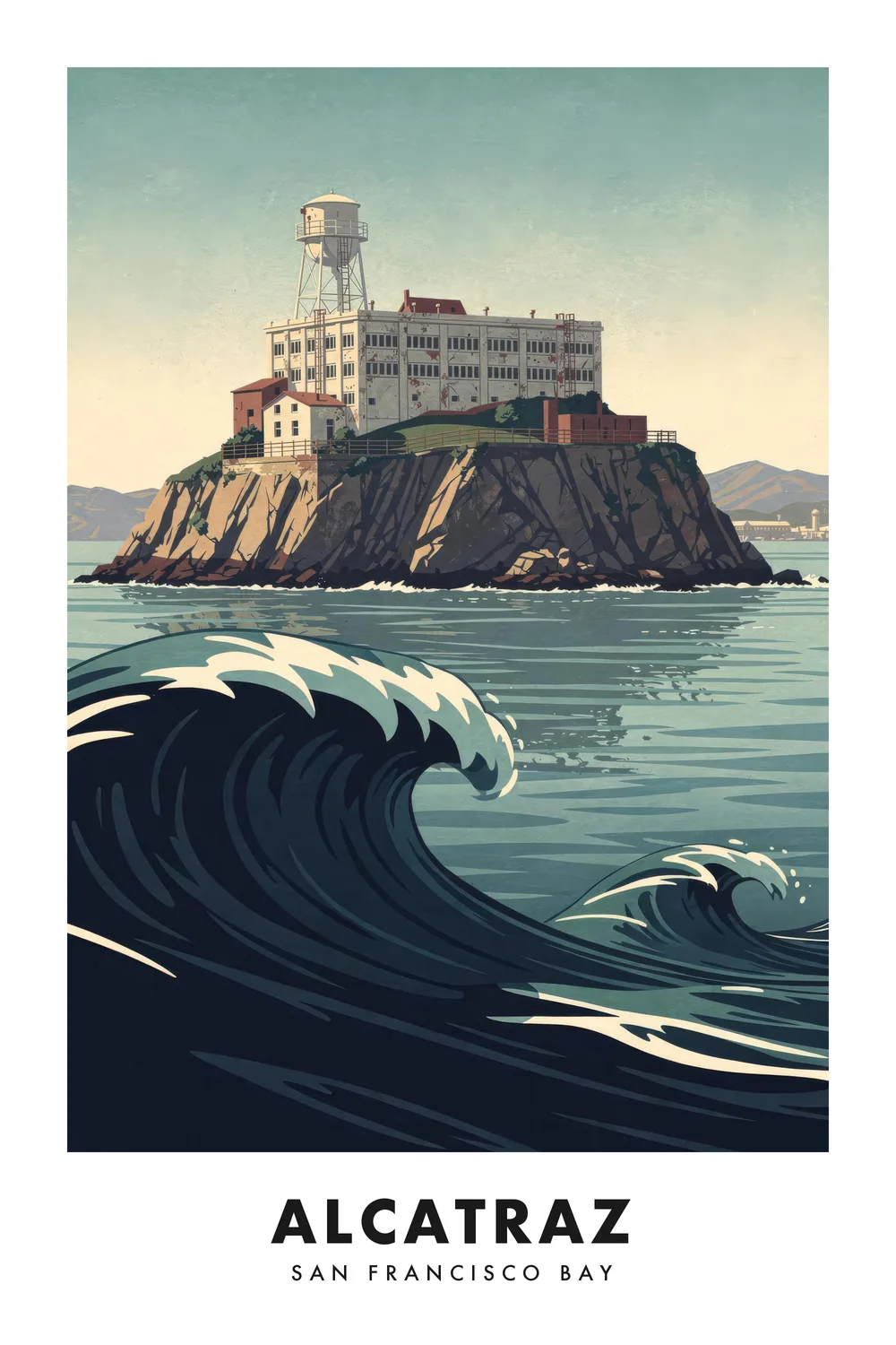
Alcatraz
California
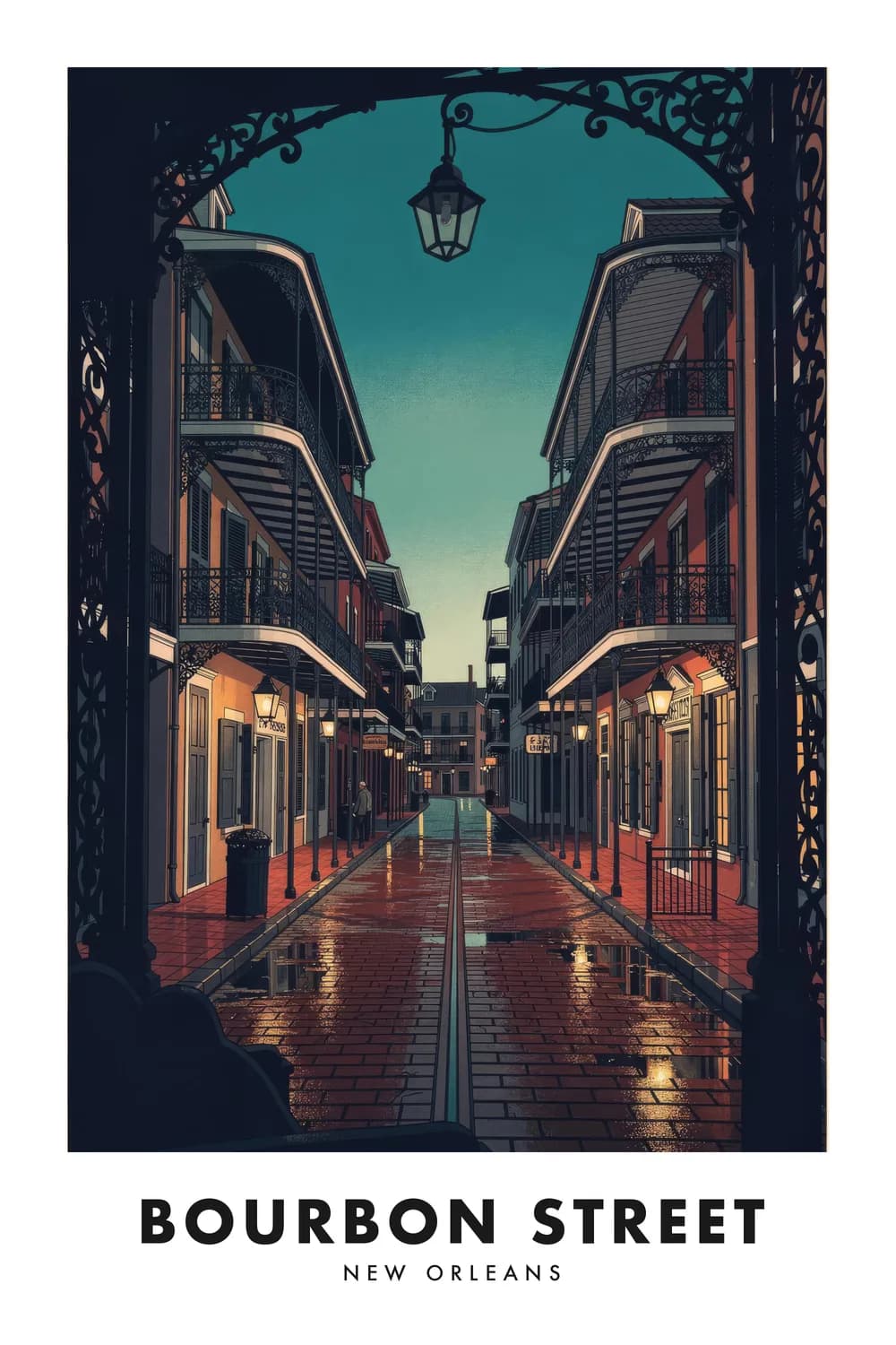
Bourbon Street
Louisiana
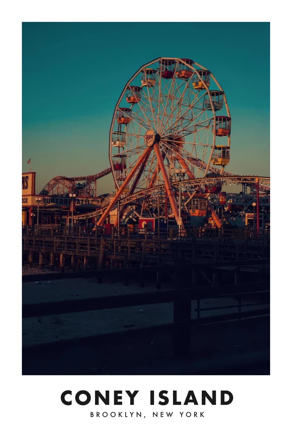
Coney Island
New York
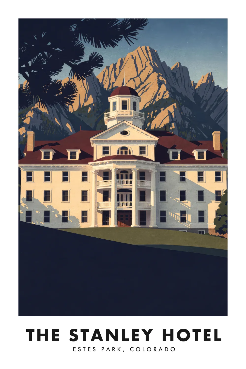
The Stanley Hotel
Colorado
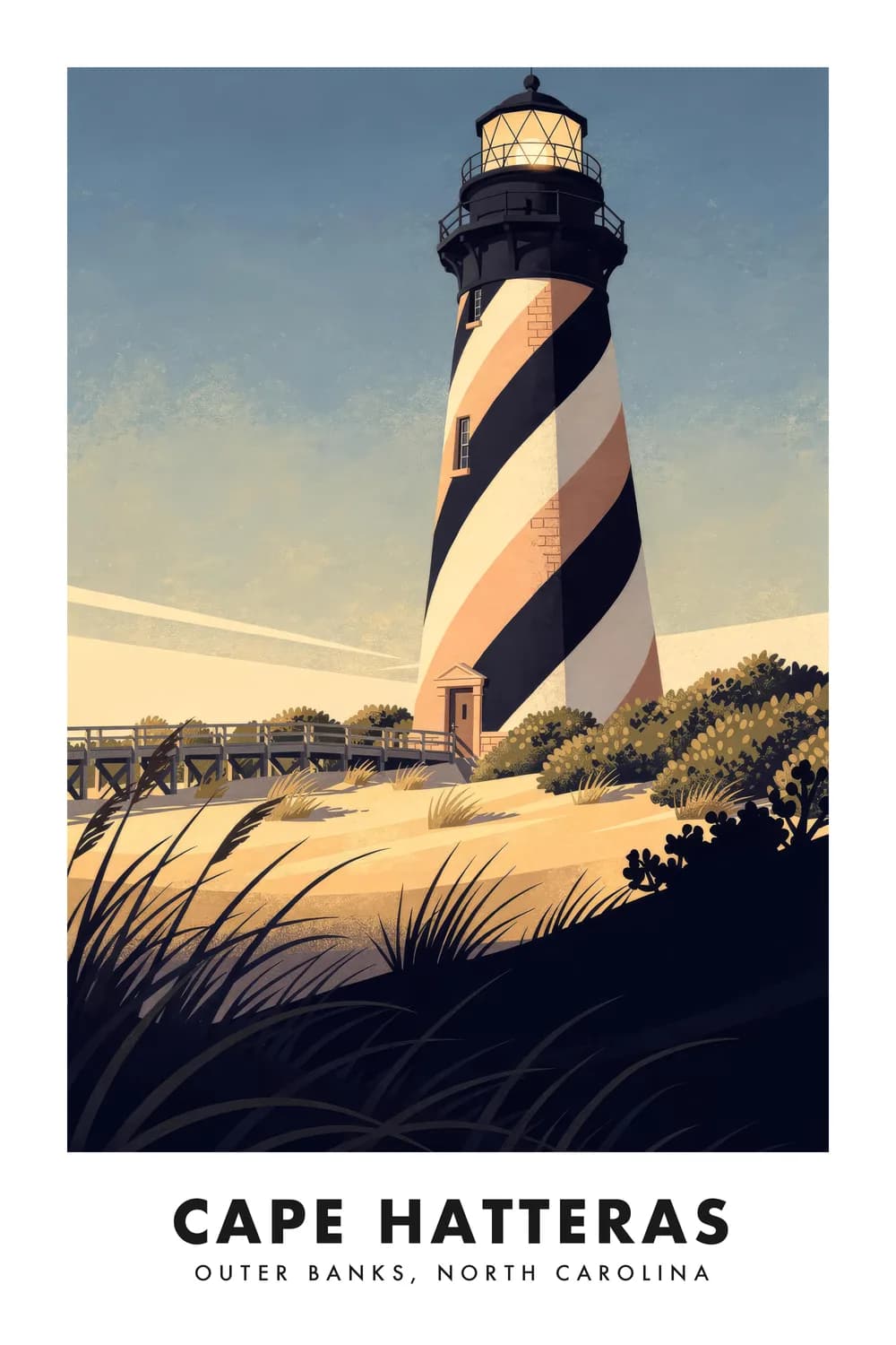
Cape Hatteras
North Carolina
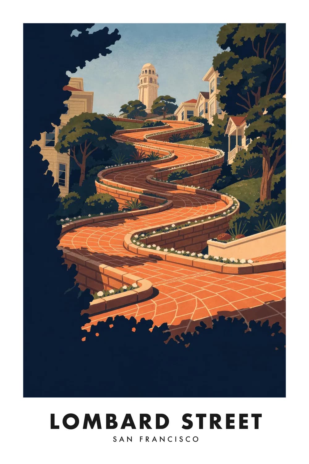
Lombard Street
California
Haystack Rock
Oregon
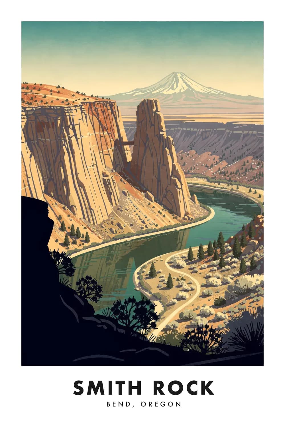
Smith Rock
Oregon
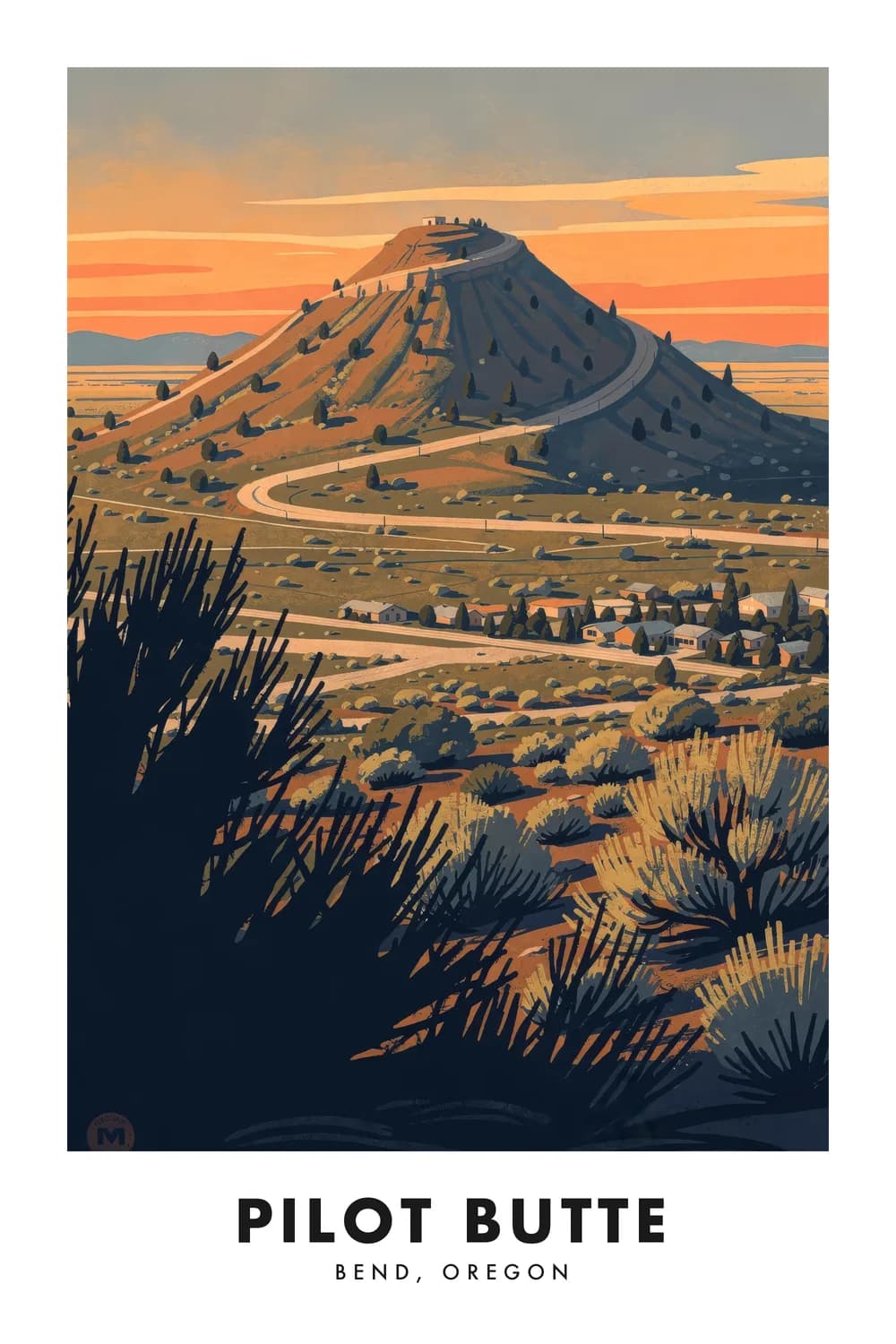
Pilot Butte
Oregon
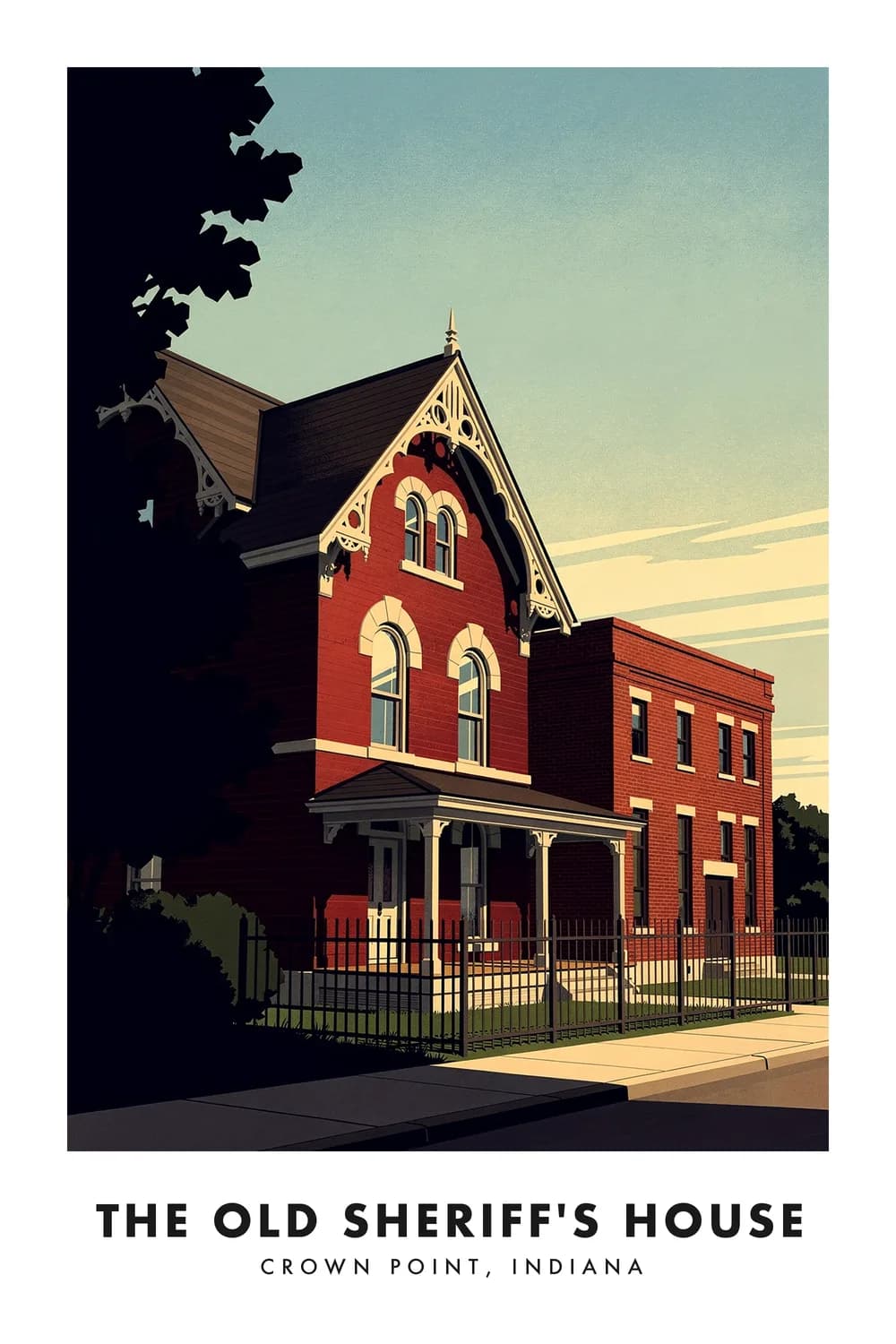
The Old Sheriff's House
Indiana
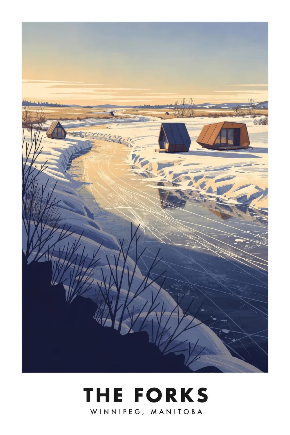
The Forks
Manitoba
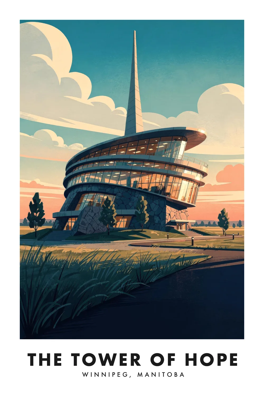
Canadian Museum for Human Rights
Manitoba
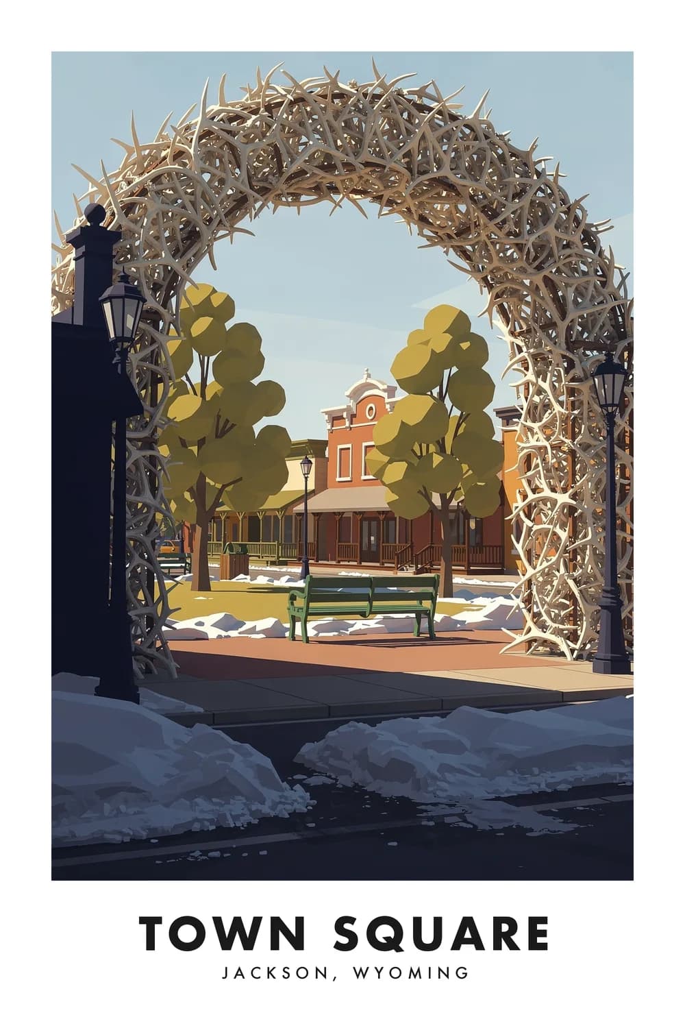
Town Square
Wyoming
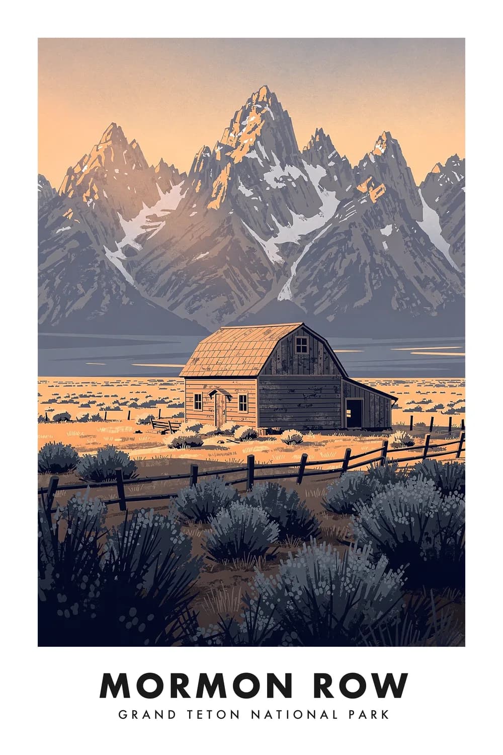
Mormon Row
Wyoming
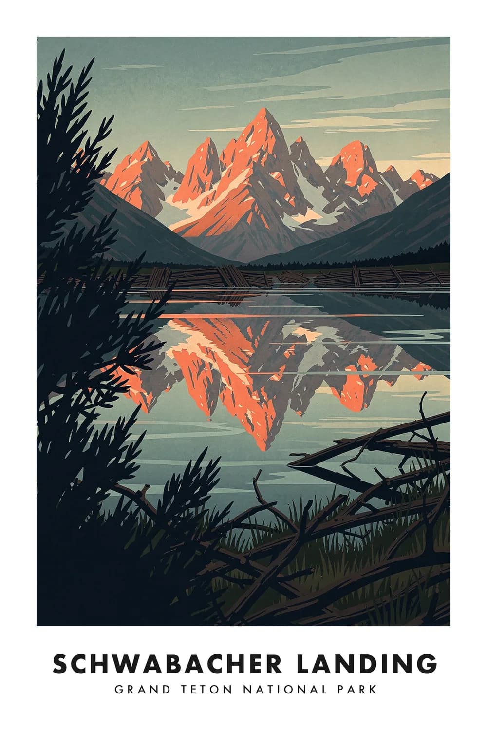
Schwabacher Landing
Wyoming
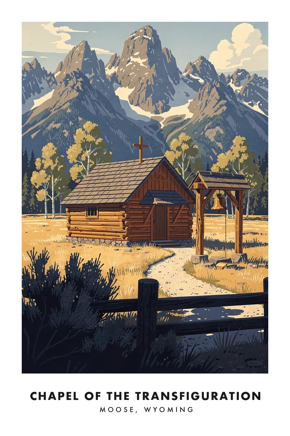
Chapel of the Transfiguration
Wyoming
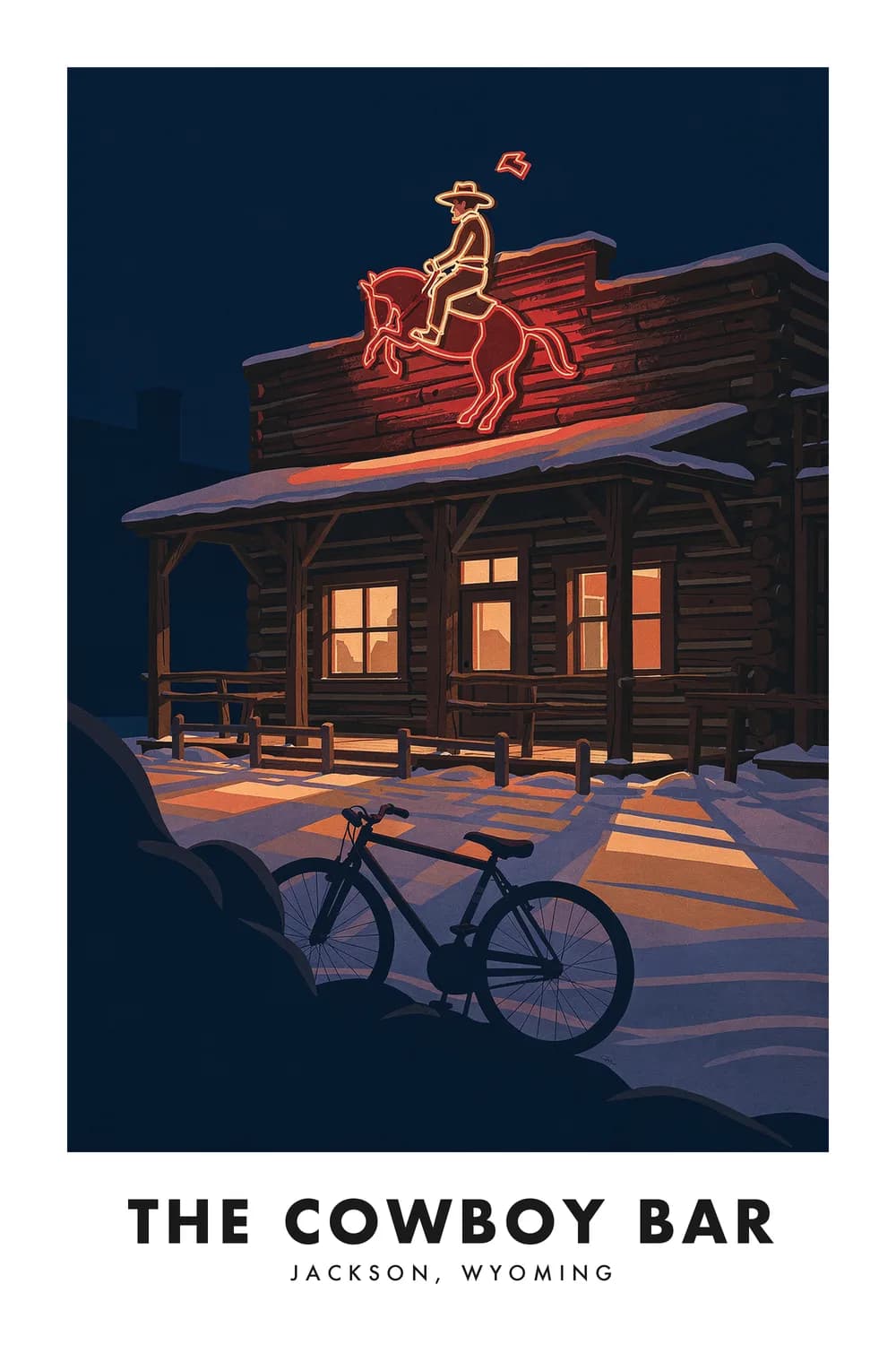
The Cowboy Bar
Wyoming
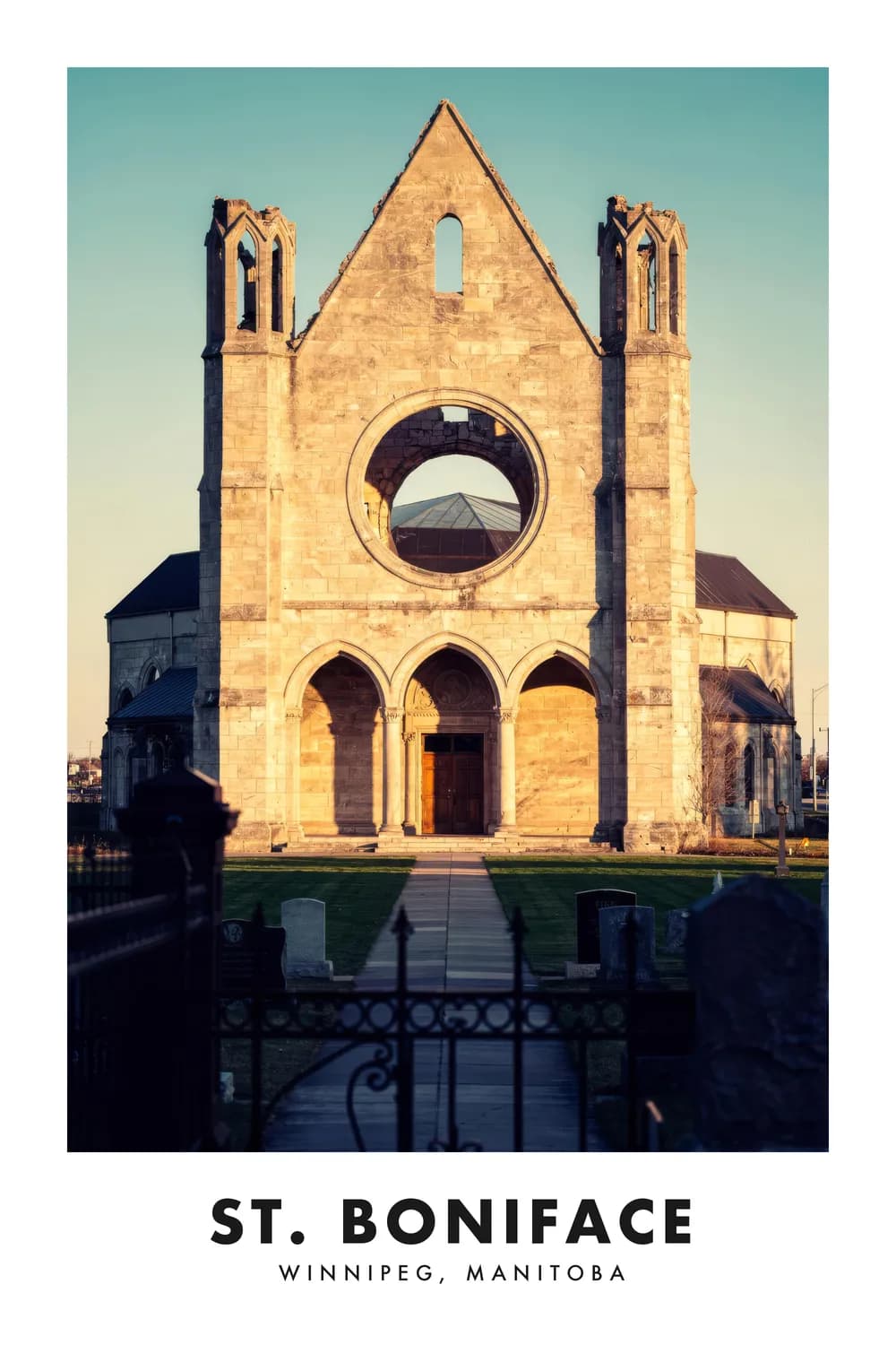
St. Boniface Cathedral
Manitoba
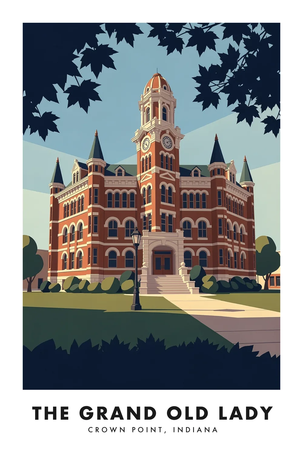
The Grand Old Lady
Indiana
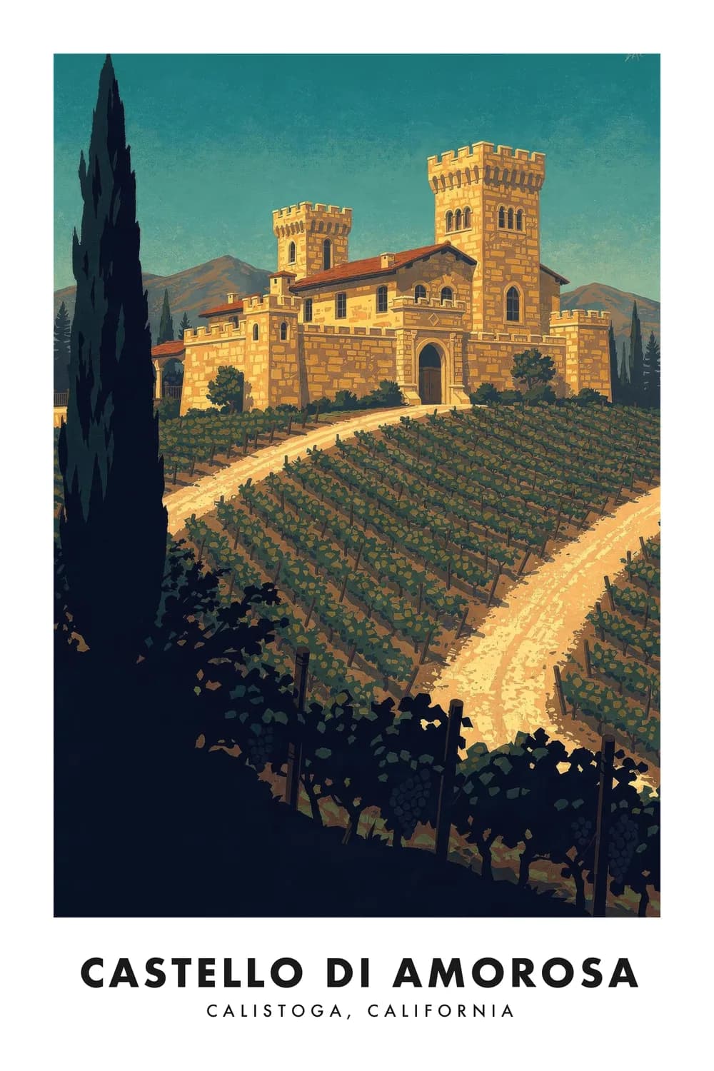
Castello di Amorosa
California
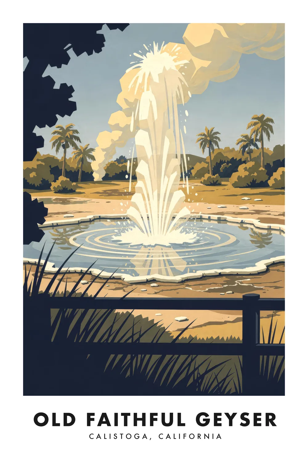
Old Faithful Geyser
California
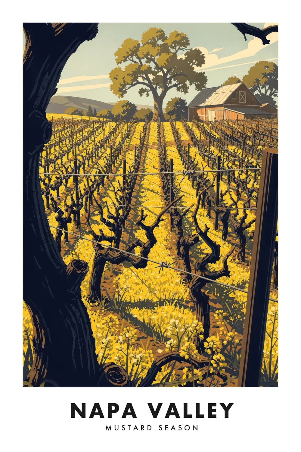
Napa Valley
California
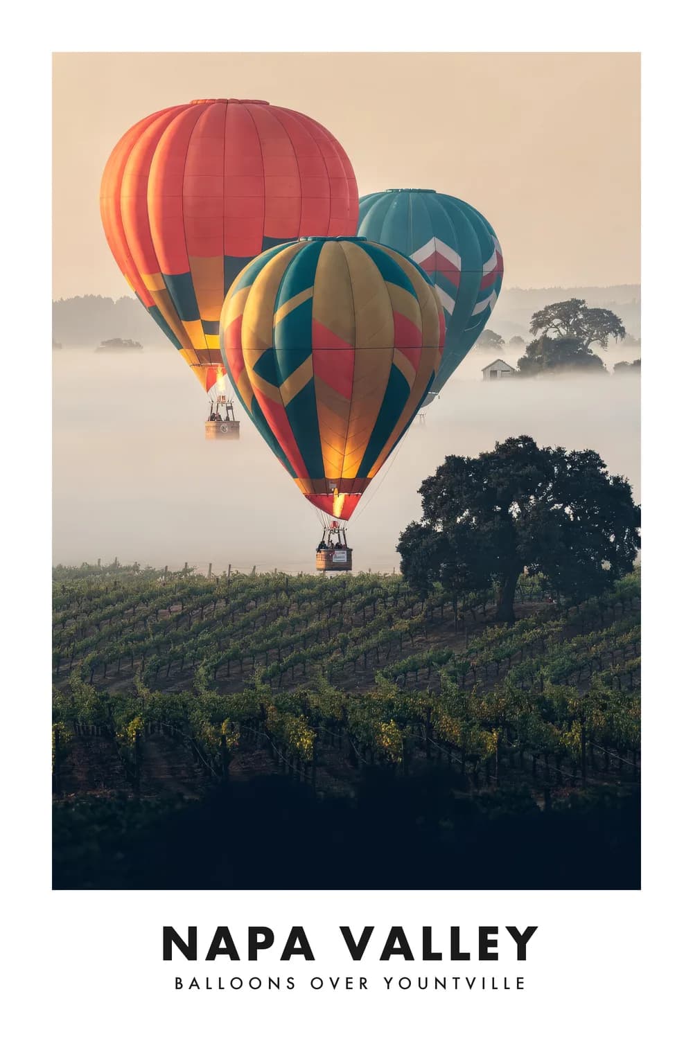
Napa Valley Balloons
California
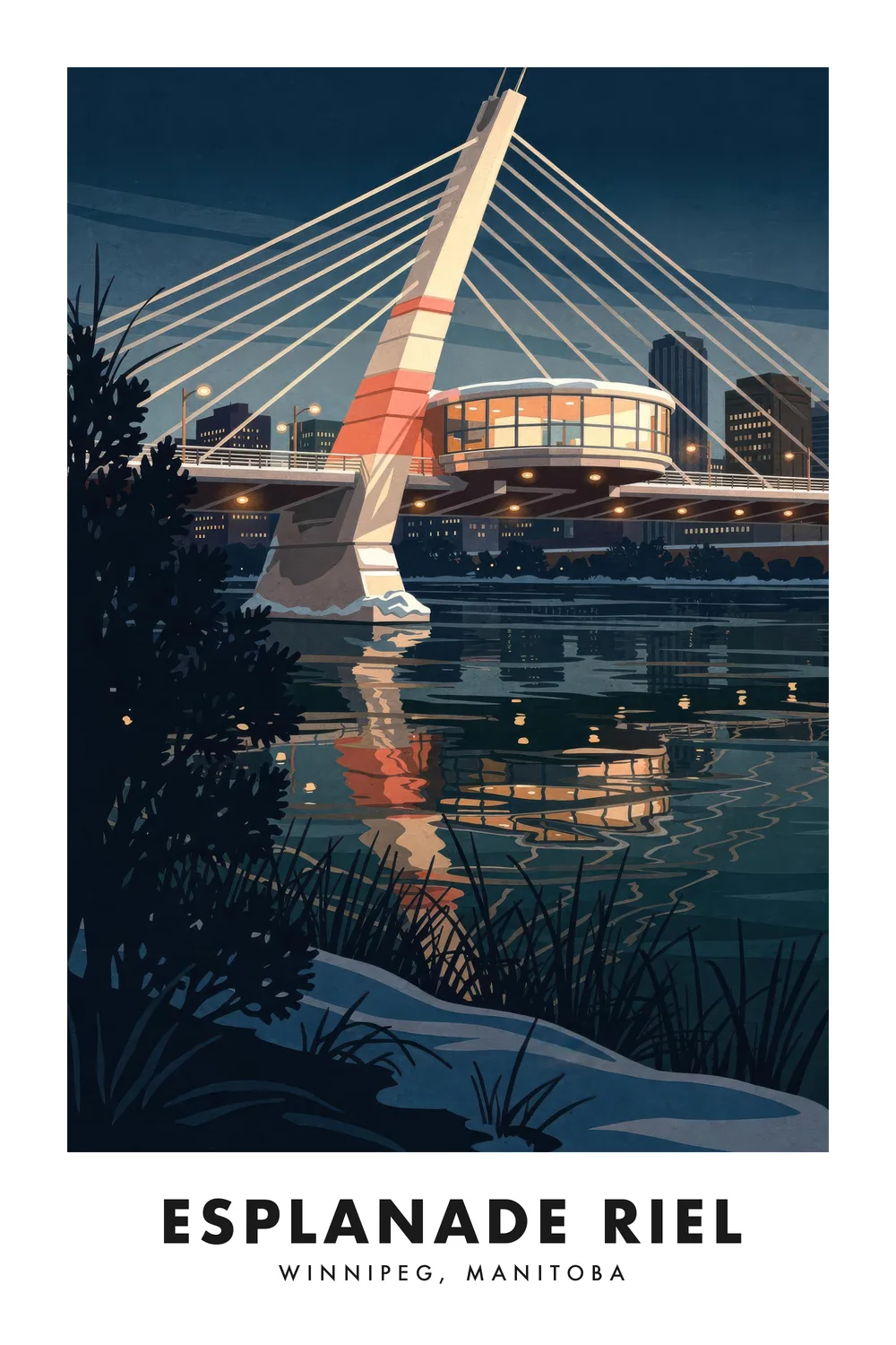
Esplanade Riel
Manitoba
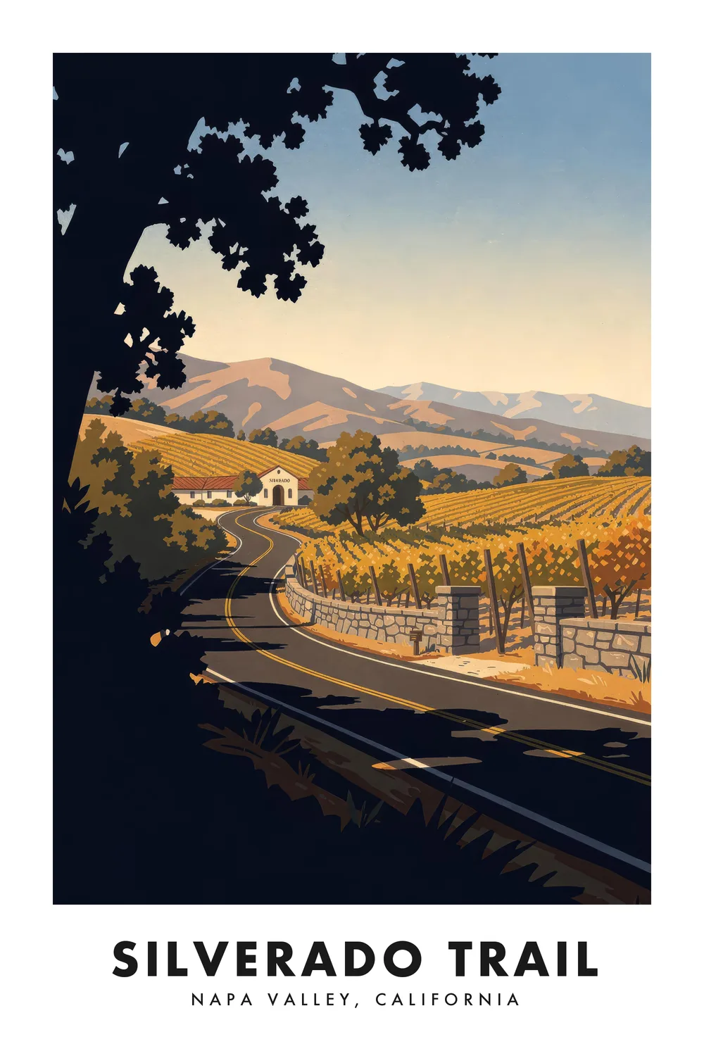
Silverado Trail
California
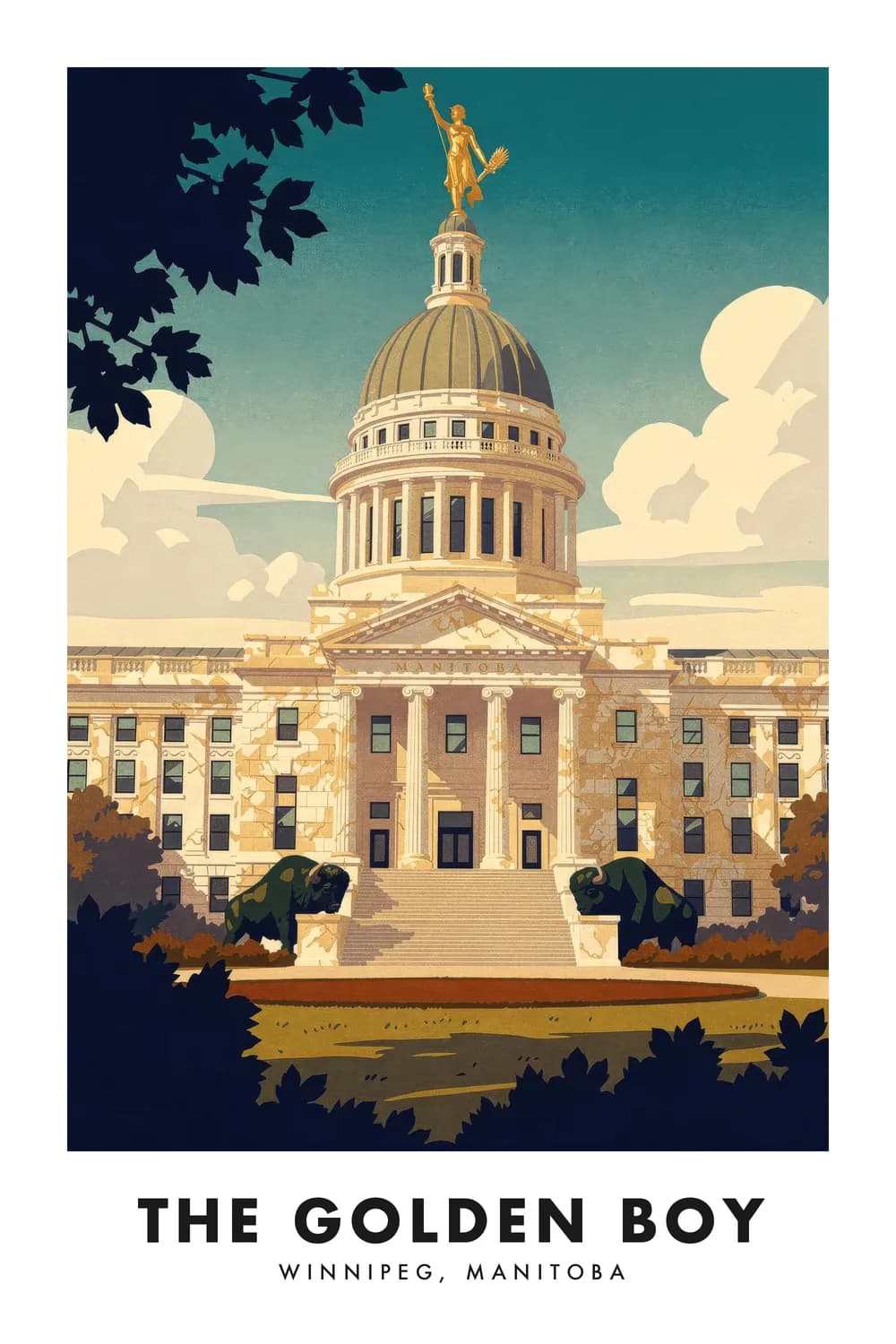
The Golden Boy
Manitoba
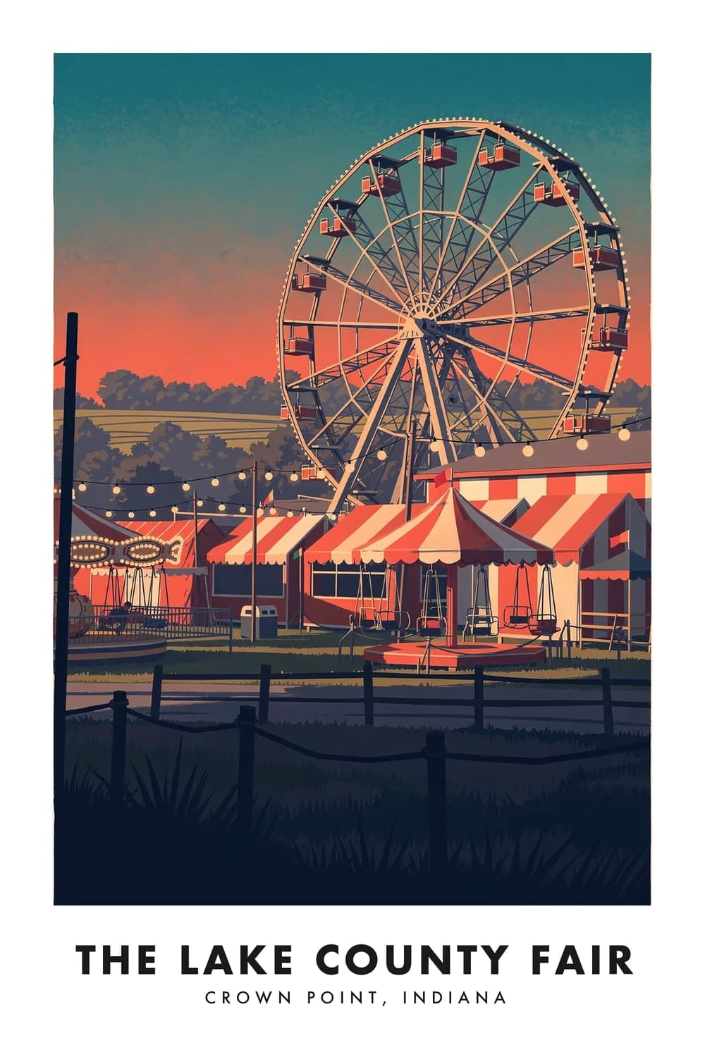
The Lake County Fair
Indiana
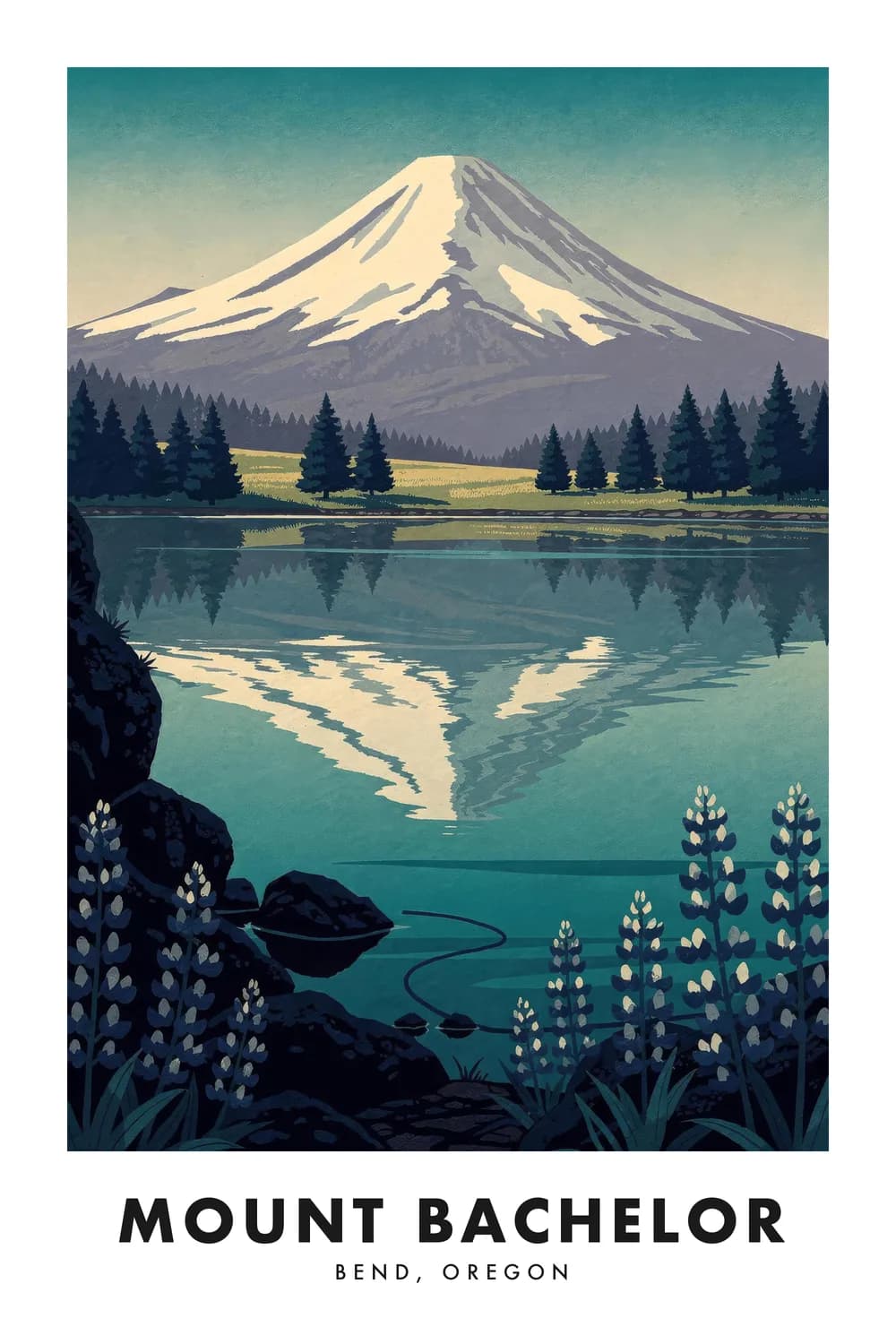
Mount Bachelor
Oregon
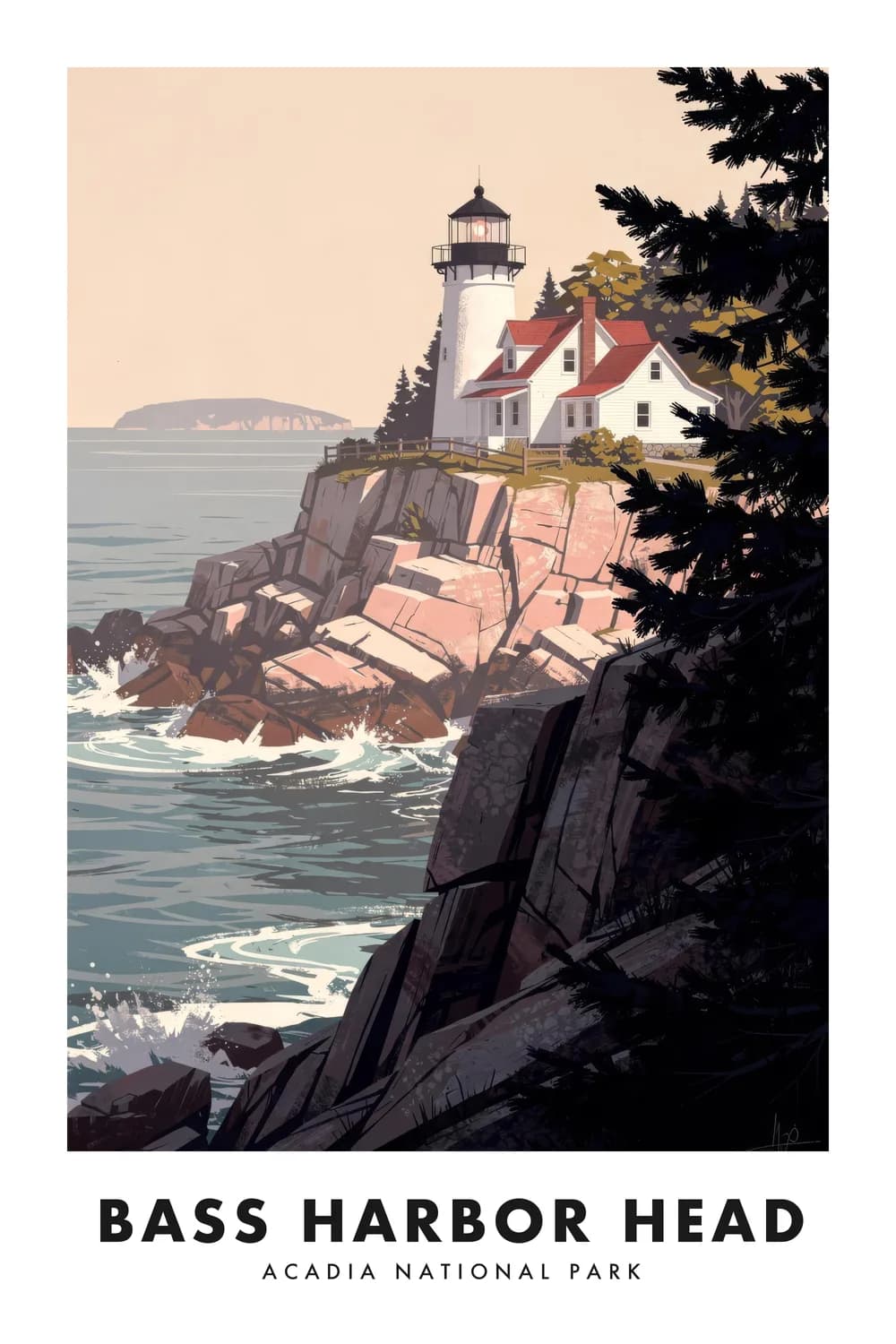
Bass Harbor Head
Maine
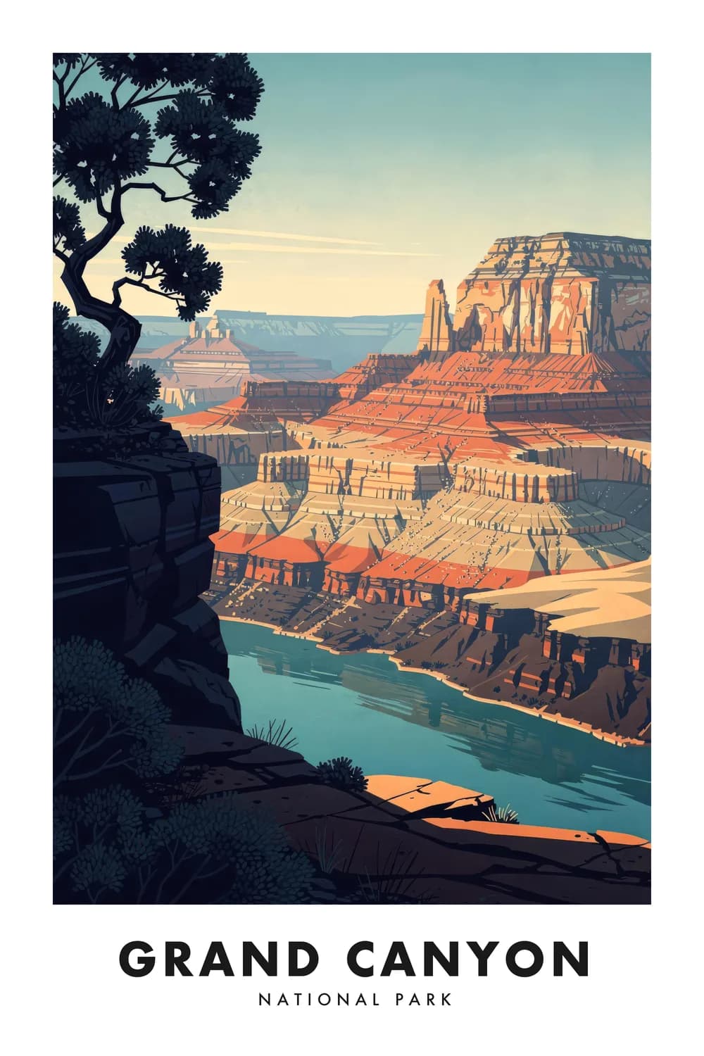
Grand Canyon
Arizona
Zion
Utah
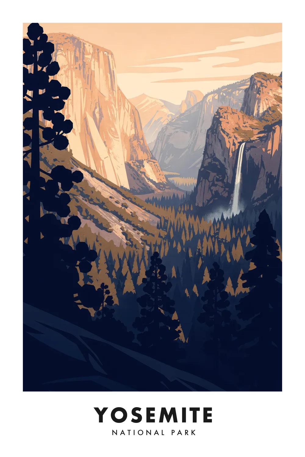
Yosemite
California
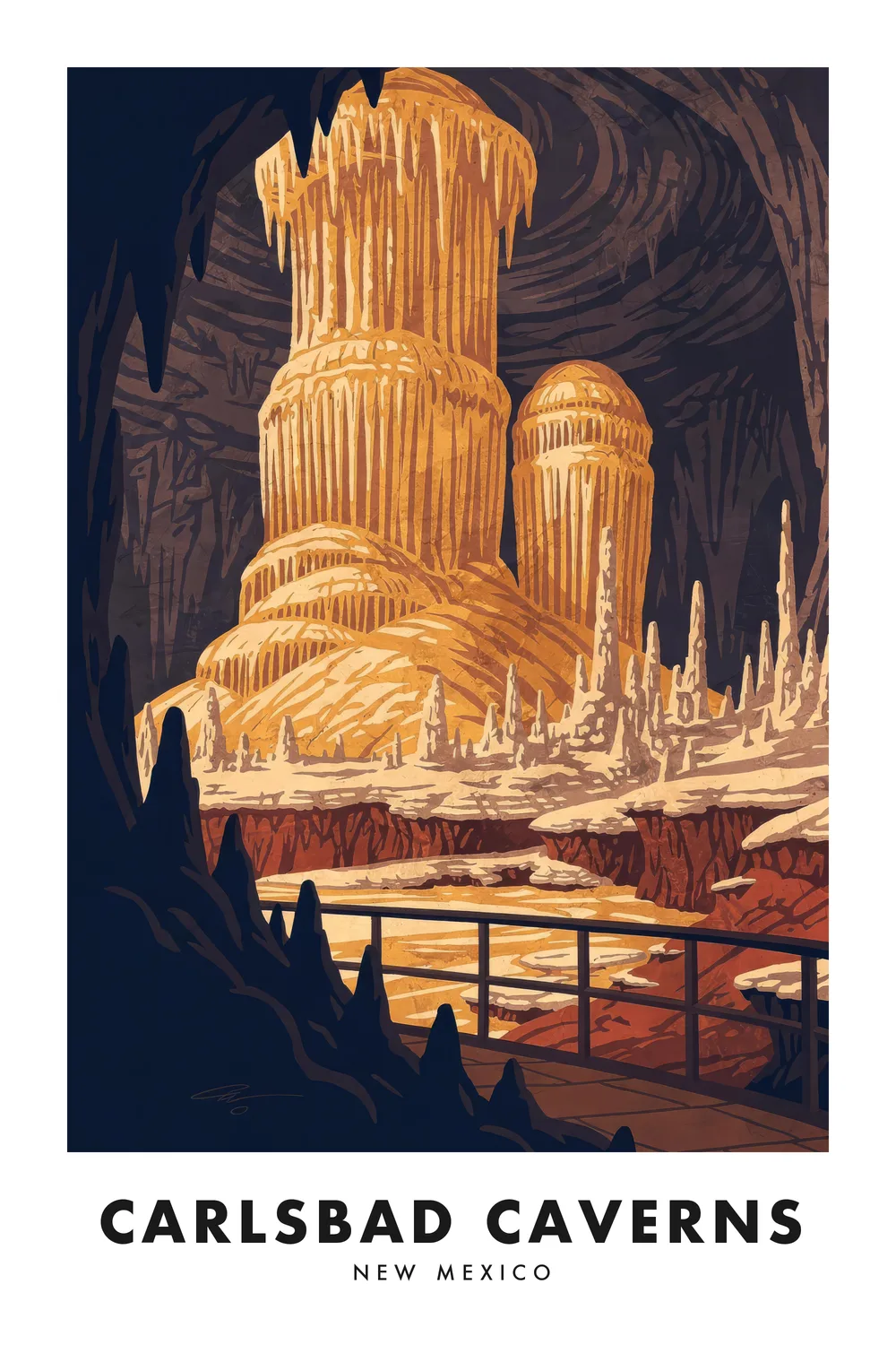
Carlsbad Caverns
New Mexico
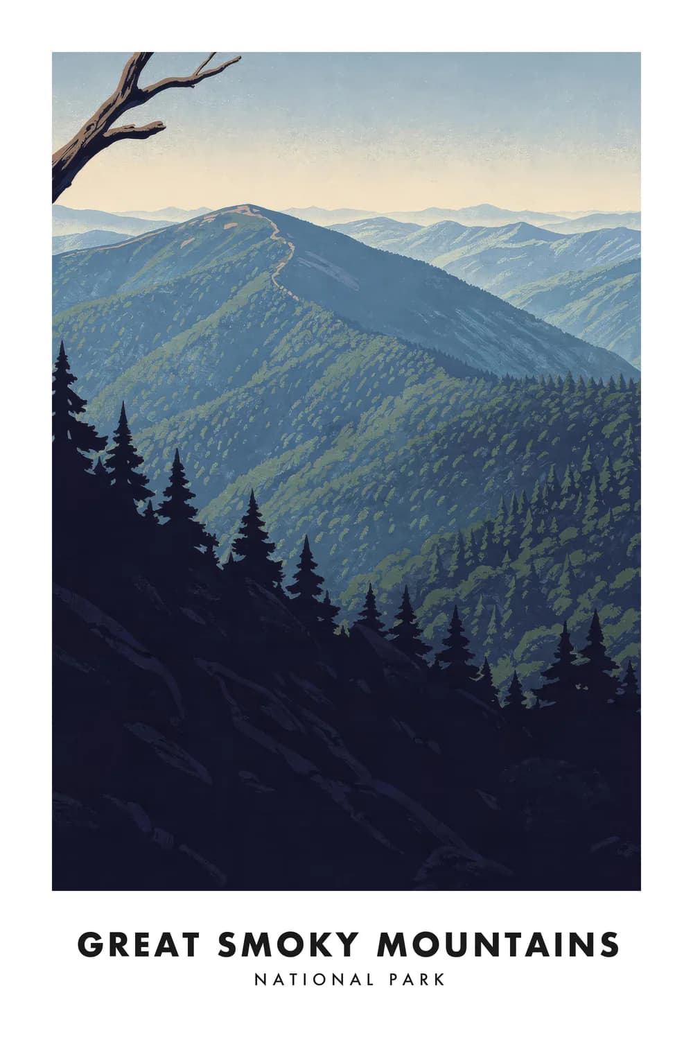
Great Smoky Mountains
Tennessee & North Carolina
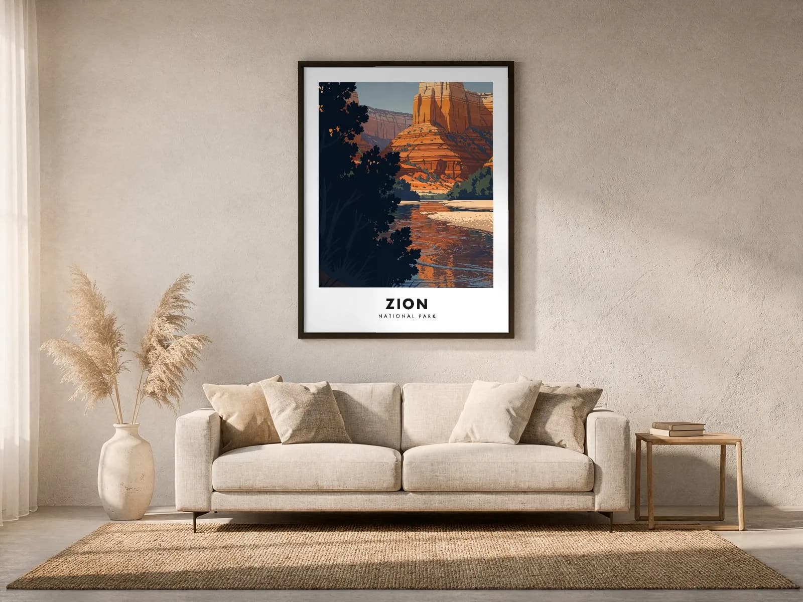
Every poster is warped into a real room through the frame’s own perspective, then relit by that room’s light. It is the difference between seeing a print and seeing a screenshot.
Titles are composited afterwards as vector outlines. That is why the spelling is right, the type is identical across all forty, and it stays sharp at any print size.
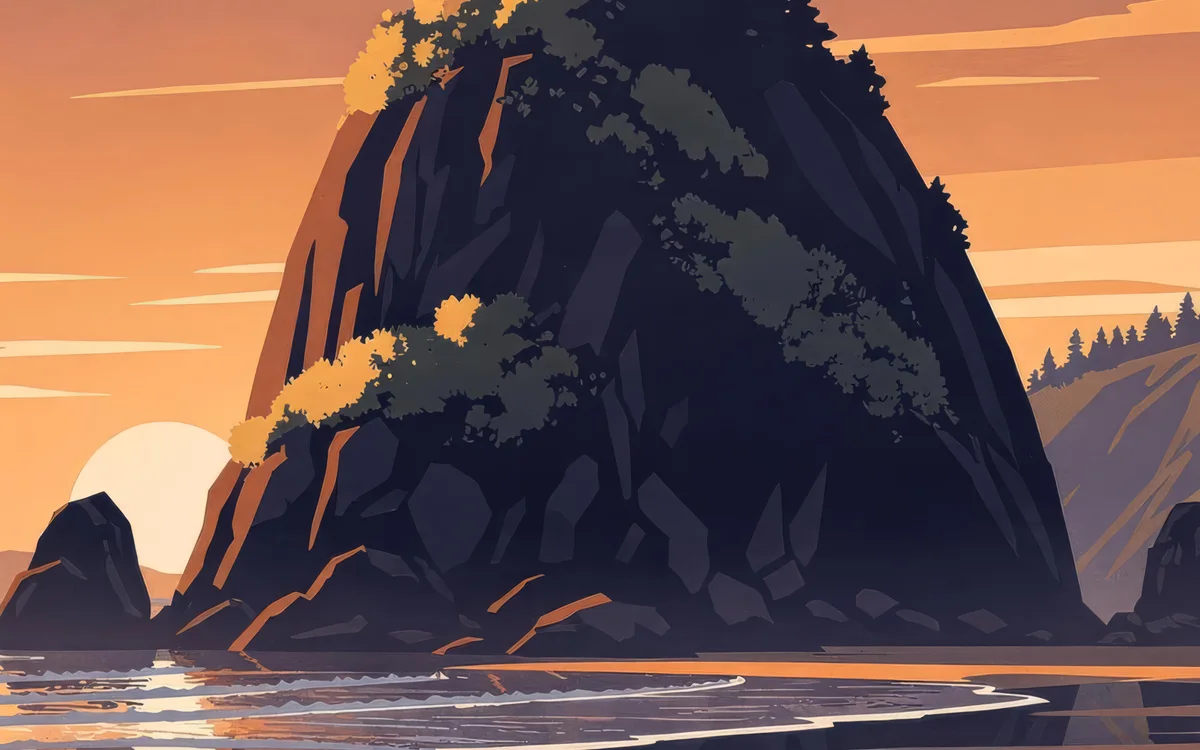
Every artwork is generated at 1024 by 1536 and never larger. Given more pixels the model quietly stops illustrating and renders a photograph instead. There is no middle ground, so print resolution comes from upscaling later.
Before anything is painted, Claude writes a brief for your place: four depth planes, one hero element, and what the light is doing.
Upscaled before it goes to press, so a 24 by 36 inch print holds up at arm’s length.
6144 x 9216
Pick one to see it against the others. Shipping is included in every price.
18 x 24"
Museum-quality matte paper, 250 gsm, acid-free, printed and shipped from the press nearest you. Type is drawn as vectors at final size, so it stays sharp at 300 DPI even on the largest print.
About ninety seconds. Claude plans the composition first, the painter runs next, and the title is typeset last. You watch all three happen.
Name the thing, not the region. A water tower, a bridge, a stretch of coast and a street corner all give the painter something to hold onto; a county name gives it nothing, and you get a generic landscape back.
Yes, and every listing says so. A language model writes the composition brief and a diffusion model paints the artwork. The house style, the palette, the depth rules and the typesetting are ours, written down and applied the same way to every poster.
We draw buildings, not trademarks. Depicting architecture from a public vantage is settled law; logos, wordmarks, team marks and sponsor boards never appear in the artwork, and titles are worded to stay clear of live marks.
A print on 250 gsm museum-quality matte paper, acid-free, produced by the press nearest your address and shipped flat or framed. The artwork is upscaled before it goes to press, never generated large.
Ninety seconds from a name to a finished poster you can hold up to the wall.